Styling Super Speedy Search Form
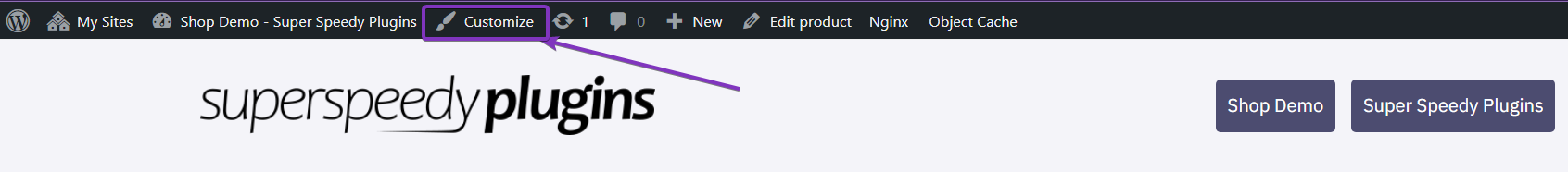
Super Speedy Search will firstly try to default to your active theme style. But you can always use CSS to style the Super Speedy Search bar to your preference. There are a few different areas in the search box. The search field, the search button, and the clear search cross that appears once a user searches. Here are a few different styling options. Copy the selectors, customise the properties, and add them to your Dashboard > Appearance > Customizer (Or click “Customize” in your admin bar.
Below is a Super Speedy Search form using the styles of the Storefront theme on a Super Speedy Plugins demo site.

Table of Contents
Search Field
To customise the search area itself and change the background colour and the text colour, use the following selectors and properties. This example changes the background of the search box and the text colour of the entered search – not the text colour of the placeholder (Super Speedy Search)
.super-speedy-search-form input[type="text"] {
	background-color: #a797c5;
	color: red;
}

As you can see, the background colour that was applied isn’t applying now, but the red text is. This is because the search box is selected. This means you can change the styling for if the box is selected or not. Let’s aim for consistency in this care. We use almost the same selectors again (copy and paste, don’t override the previous) and add the “focus” pseudo-class.
.super-speedy-search-form input[type="text"]:focus {
	background-color: #a797c5;
	color: red;
}
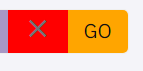
The search button can also have pseudo-classes attached to it. In this case, there is a “hover” pseudo-class. When a user hovers over the button it changes colour.


Similarly to the before, it uses that same selectors, with the added pseudo-class.
.super-speedy-search-form .sssbuttonwrapper .sss_search_button {
	background-color: orange;
	color: #111111;
}

.super-speedy-search-form .sssbuttonwrapper .sss_search_button:hover {
	background-color: pink;
	color: #111111;
}

Clear Search
After a user begins typing, an X will appear to the left of the search button to clear the search. The same applies here. It can have a hover effect similarly as above. It’s default background is transparent, but any colours can be applied.
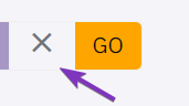
.super-speedy-search-form .sssresetwrapper button[type="reset"] {
	background-color: red;
}
These are all some quick styling options. A lot more can be done with a little more CSS knowledge. This will help target the main areas.
