Filter groups and the layout editor
A filter group puts several filters behind one button. Shoppers on a phone see one tidy row of buttons, such as Shop by, Size and More, instead of a long column of open filters, and each button opens a panel or a popup holding the filters inside it.
The layout editor decides how each place your filters sit looks on desktop and on mobile: open under their titles, as a row of buttons, or all behind a single Filters button. Every filter is drawn once, in the page the server sends, and the screen width decides which presentation shows.
Available since 6.74.0.
Groups and presentations are in the HTML from the first paint. Nothing is moved, hidden or retitled by a script after the page loads, so the sidebar and the products do not jump, page caches keep working, and a filter that appears on desktop and on mobile is still only one filter with one set of term counts.
Create a group
A group is created where you edit a filter.
In a widget, open the filter in Appearance > Widgets and use its Group field:
- Choose New group… and type the group’s name. The name is the button’s title, for example Shop by. Choose whether it opens as a Popout (a panel under the button) or a Popover (a popup over the page).
- Save the widget.
- Open the next filter you want in the group, choose the group by name in its Group field, and save.
Every Super Speedy Filters widget has the Group field: taxonomy and attribute filters, price, post meta range and toggle, sort, In stock, On sale, Recent products and Active filters.
The group’s button sits where its first filter sits in the widget area, and the filters inside it keep their widget order. A filter’s Container Type sets how it looks inside the group: open, minimisable or an accordion.
In the block editor, add a Super Speedy Filter Group block and put the filter blocks inside it. In the block’s settings, the Group field picks one of your groups, or New group… creates one from a name, so a block group and a widget group can be the same group with the same title, type and icon.
Auto Configure’s One button layout builds a group holding every filter it creates, titled Filters. Rename it, change its icon or move filters out of it in the Groups tab like any other group.
The Groups tab
Super Speedy > Filters > Groups lists every group on the site, wherever its filters are.
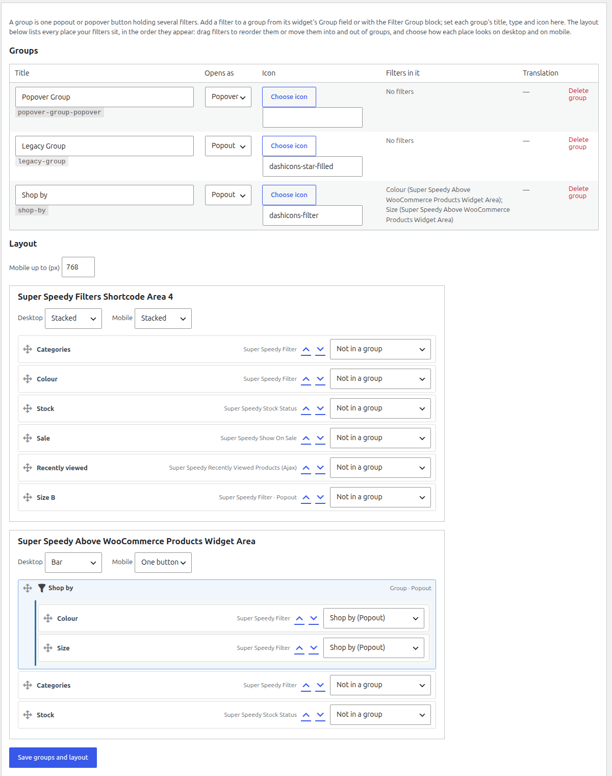
| Column | What it does |
|---|---|
| Title | The button’s text. |
| Opens as | Popout: a panel under the button. Popover: a popup over the page with its own close button. |
| Icon | A Dashicon shown before the title. Choose icon opens the picker. |
| Filters in it | Each member and the widget area it sits in, and any Filter Group blocks that use the group. |
| Translation | On a WPML or Polylang site, where to translate the title (see below). |
| Delete group | Removes the group when you save. Its filters stay where they are, out of any group. |
Click Save groups and layout to store your changes.
The layout editor
Below the groups, the tab lists every place your filters sit, in the order they appear on the page.
- Widget areas, including your theme’s shop sidebar and the area above the products. Each filter is a row; a group is one row with its filters nested inside it.
- Block templates that hold filter blocks, for example the Product Catalog template on a block theme.
Reorder and regroup filters
In a widget area, drag a row by its handle to move it up or down, into another widget area, into a group or out of one. A group row moves with all of its filters.
Without a mouse, each row has Move up and Move down buttons and a Group menu. Tab to a row’s button and press Enter to move it one place; choose a group from its menu to move the filter into that group. Every move is announced to screen readers.
Saving writes the new order to the widget area, exactly as moving widgets in Appearance > Widgets would.
Block templates show their filters read-only, with an Edit in the Site Editor link: change the order and the groups of block filters in the Site Editor. Their desktop and mobile presentations are set here.
Desktop and mobile presentations
Each place has a Desktop and a Mobile choice.
| Presentation | What shoppers see |
|---|---|
| Stacked (default) | Each filter open under its title, in a column, as your theme draws a sidebar. Groups show as their button. |
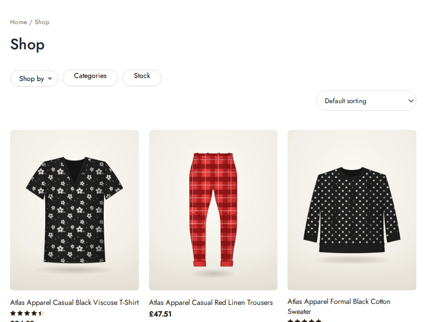
| Bar | Every filter and every group is a button, side by side, wrapping onto a second row when the space runs out. Each button opens its filter in a panel. |
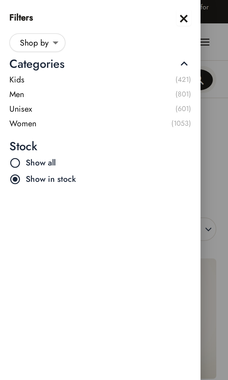
| One button | A single Filters button. It opens a drawer from the side of the screen holding every filter in that place, stacked. |
Mobile up to (px) sets the width where the two meet, 768 pixels by default. A screen this wide or narrower uses the Mobile choice; a wider one uses Desktop. Tablets follow whichever side of that width they are on.
A place left on Stacked for both is drawn exactly as your theme draws it, with no extra markup.
A common setup is filters above the products as a Bar on desktop and One button on mobile. Each filter is drawn once, so there is no need to add a second copy of every filter for phones and hide one of them with CSS.
Keyboard and screen readers
Every button says whether its panel is open. The One button drawer opens as a dialog: focus moves to its close button, Escape closes it, and focus returns to the Filters button. A filter chosen in the drawer updates the products and the drawer stays open, so the shopper can choose another.
Translating group titles
On a site running WPML or Polylang, each group title is a translatable string named group:<group id>:title in the Super Speedy Filters domain: in WPML > String Translation, or Languages > Translations in Polylang. The Groups tab shows the string’s name for each group. The Filters label of the One button comes from the plugin’s own translation files.
Groups set up with an older version
After updating, groups set up the older way are converted to groups the first time an administrator opens wp-admin, and they look the same:
- Filters whose Container Type was Popout Group or Popover Group with a Group Title become members of a group with that title.
- In stock, On sale and Recent products widgets that shared a Group Icon become one group, titled with the first one’s title.
- A group with filters in two widget areas is shown once, where the first of its filters appears on the page, with all of its filters inside it.
- Filter blocks saved with Popout Group or Popover Group are drawn as one Filter Group block at the first one’s position. The page or template content is not changed.
- Hide widget area above products behind Filters button becomes the area above the products’ presentation: Always hide is One button on desktop and mobile, Hide on small screens is Stacked on desktop and One button on mobile.
The previous settings are kept in the sspssf_filter_groups_migration_backup option.
Some themes put the whole shop sidebar behind their own mobile filter button. Astra does this on narrow screens. A One button presentation in that sidebar then sits inside the theme’s drawer; use the area above the products for the mobile One button instead, or switch the theme’s off-canvas sidebar off.
Further reading
Written for Super Speedy Filters 6.74.0.
Fixing this on a real store?
Super Speedy Filters does it for you. Or get every Super Speedy plugin with the All Access Pass.
 Super Speedy Filters
Fast product filters and pretty, indexable permalinks on every archive
 All Access Pass
Every Super Speedy plugin, one licence, with updates and support.
Comments